
Home Assistant Card Editor
The ATLAS Home Assistant Card Editor is the first visible reference application in the ATLAS environment. It is used to design Home Assistant cards visually, import existing YAML cards and prepare exportable card packages or HACS-oriented bundles.
The local demo uses:
http://127.0.0.1:4174/Connection settings are managed through Atlas Administration:
http://127.0.0.1:4175/Expert Workflow
The editor now opens directly in the Expert workflow. The former visible Simple mode and the Simple/Expert switch have been removed. Import, HA card import, YAML paste, resource debug and entity selection remain available as tools.
Cards are placed from the left card list onto a Home-Assistant-like grid surface. They can be moved, edited, nested and exported as Home Assistant YAML.
Home Assistant Connection
The Card Editor can receive a Home Assistant URL and access token from Atlas Administration. The token is not written permanently into the editor; it is only used as a session handoff.
The editor currently supports:
- connection through the Home Assistant WebSocket API
- loading entities through
get_states - local cache for entities and entity domains
- synchronization status below the connection state
- search and filtering by domain, name or entity ID
- Lovelace resource checks through the browser WebSocket and Admin WebSocket proxy
The resource debug panel can be enabled through Show resource debug. It shows whether the browser WebSocket, the Admin WebSocket proxy or a fallback is stuck.
Card List
The Expert card list contains Core cards and detected Community cards. It can show local templates, known HACS resources and scan-only resources.
Supported base cards include:
- Entity
- Entities
- Overview / Glance
- Button
- Grid
- Sensor
- Vertical stack
- Horizontal stack
- Thermostat
- Link
- Webpage
- Mushroom Template
- Bubble Card
- Tabbed Card V2
Scan-only entries are registered Lovelace resources for which ATLAS does not yet include a built-in card mapping. They can be mapped locally to the matching custom:* Lovelace card type. After that mapping, they become active custom cards in the palette, can be placed through drag and drop and keep their resource path when resource snippets are exported. Palette entries that are not useful as cards, such as JavaScript helper resources, can be marked as hidden locally. Hidden cards disappear from the normal list, remain visible in the full list and can be restored from there. The import tools also include an opt-in automatic card type mapping option. It tries to derive a custom:* card type for unknown registered resources from the JavaScript filename and therefore carries a red safety warning.
Container Cards
Expert mode supports container cards for:
vertical-stackhorizontal-stackcustom:tabbed-card-v2
Cards can be placed into these containers through drag and drop. Tabbed Card V2 manages tabs and the cards contained in each tab. Stack cards keep their contained cards as separate elements and show them as a text list in the info box.
Import
The editor can import Home Assistant card configurations from:
- YAML files
- YAML from the clipboard
- JSON
- ATLAS Card Packages
- HACS bundles with embedded
atlas/*.atlas-card.json
During import, ATLAS detects card_mod and uix styles. Entity styles are assigned to the matching entities; global styles remain visible as their own style block. The original YAML should stay as close as possible to the imported source and only change when the user edits the card.
Hand-written custom:tabbed-card-v2 cards with tabs[].card, nested horizontal-stack/vertical-stack sections and raw custom cards are detected and opened directly in Expert mode as a container structure.
Export
The editor can create several artifact types:
- Home Assistant YAML
- Expert HA card YAML
- Card script
- Card package
- HACS-oriented bundle
- resource list
When exporting an HA card, users can choose whether styles are written as card_mod or uix. Export filenames receive a Windows-style counter when a name already exists.
Tabbed Card V2
Tabbed Card V2 is handled as its own ATLAS card and exports as:
type: custom:tabbed-card-v2Expected resource:
/hacsfiles/tabbed-card-v2/tabbed-card-v2.jsExport prerequisite: ATLAS Tabbed Card V2 must be installed in Home Assistant. It belongs to the ATLAS plugin/card line and is provided through the ATLAS repository:
https://github.com/rockbaer2007/atlas
The editor notes that Tabbed Card V2 is its own card. It is inspired by the original kinghat/tabbed-card, but maintained as a separate ATLAS variant.
The built-in Home Assistant editor for the card accepts YAML or JSON directly. Multi-line YAML blocks such as >- and |- stay multi-line values, so Mushroom template chips, Jinja expressions and card_mod styles are not destroyed when the code is applied.
Opacity values for active and inactive tab backgrounds are rendered as stable color values before switching tab content. This keeps transparent tab backgrounds consistent after moving between tabs.
Tabbed Card V2 Styling
Tabbed Card V2 keeps the Material tab variables and adds dedicated variables for tab backgrounds, radii and spacing:
| Name | Default | Description |
|---|---|---|
--mdc-theme-primary | --primary-color | Active tab text, indicator and accent color. |
--mdc-tab-text-label-color-default | --secondary-text-color | Inactive tab text color. Use an rgba(...) value with alpha when transparency is needed. |
--mdc-typography-button-font-size | 14px | Tab label font size. |
--tabbed-card-v2-card-background | Home Assistant card background | Background of the outer card. Use transparent for a glass/overlay layout. |
--tabbed-card-v2-card-border | Home Assistant card border | Border of the outer card. |
--tabbed-card-v2-card-border-radius | Home Assistant card radius | Border radius of the outer card. |
--tabbed-card-v2-content-padding-side | 0 | Equal left and right spacing inside the card content area. |
--tabbed-card-v2-content-padding-bottom | 0 | Bottom spacing inside the card content area. |
--tabbed-card-v2-tabbar-background | transparent | Background of the whole tab bar. |
--tabbed-card-v2-active-background | transparent | Background of the active tab. |
--tabbed-card-v2-active-background-opacity | 100 | Active tab background opacity from 0 to 100. |
--tabbed-card-v2-inactive-background | transparent | Background of inactive tabs. |
--tabbed-card-v2-inactive-background-opacity | 100 | Inactive tab background opacity from 0 to 100. |
--tabbed-card-v2-hover-background | --secondary-background-color | Background while hovering or focusing a tab. |
--tabbed-card-v2-tab-border-radius-top | 0 | Top-left and top-right radius for each tab. |
--tabbed-card-v2-tab-border-radius-bottom | 0 | Bottom-left and bottom-right radius for each tab. |
--tabbed-card-v2-tabs-padding-left | 0 | Space before the first tab. |
--tabbed-card-v2-tabs-padding-top | 0 | Space above the tab row. |
--tabbed-card-v2-tabs-gap | 0 | Space between tabs. |
--tabbed-card-v2-indicator-inset | 0 | Horizontal inset for the active tab indicator. |
--tabbed-card-v2-indicator-border-radius | 0 | Border radius for the active tab indicator. |
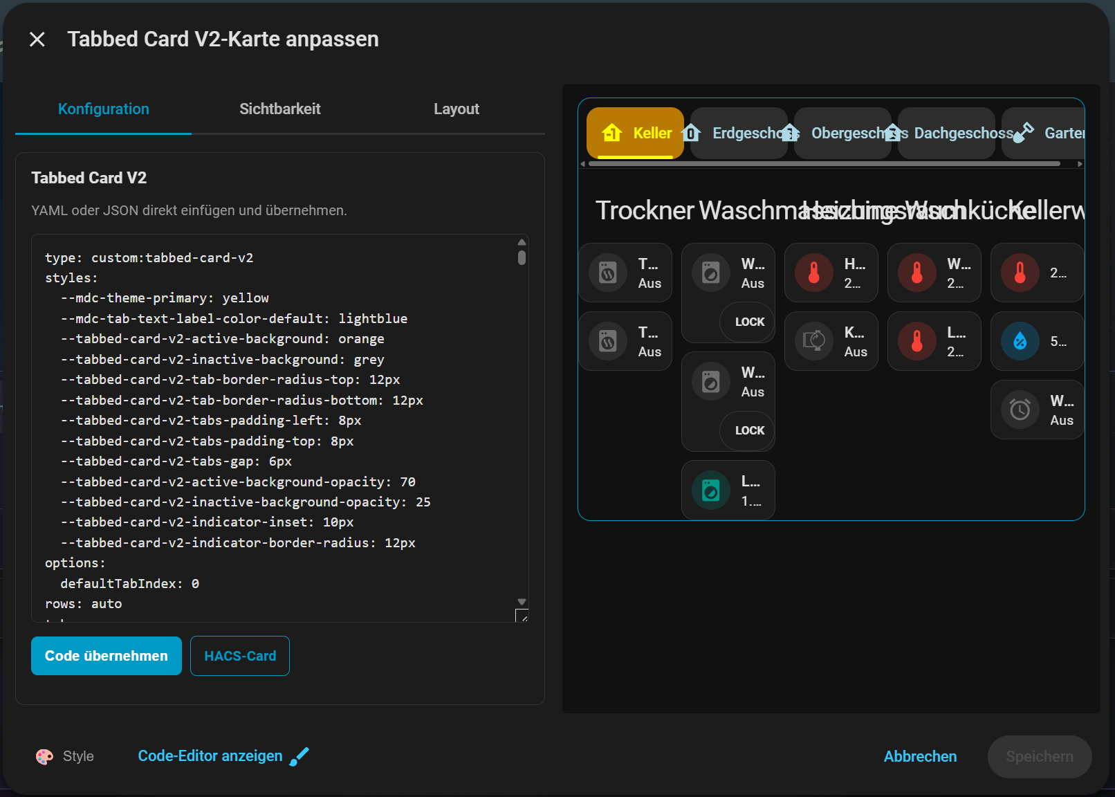

Example:
type: custom:tabbed-card-v2
styles:
  --mdc-theme-primary: "#ff9800"
  --mdc-tab-text-label-color-default: "rgba(255,255,255,0.75)"
  --tabbed-card-v2-card-background: "transparent"
  --tabbed-card-v2-card-border: "0.2px solid var(--primary-color)"
  --tabbed-card-v2-card-border-radius: "12px"
  --tabbed-card-v2-content-padding-side: "16px"
  --tabbed-card-v2-content-padding-bottom: "16px"
  --tabbed-card-v2-tabbar-background: "rgba(0,0,0,0.18)"
  --tabbed-card-v2-active-background: "#ff9800"
  --tabbed-card-v2-active-background-opacity: 35
  --tabbed-card-v2-inactive-background: "#ffffff"
  --tabbed-card-v2-inactive-background-opacity: 8
  --tabbed-card-v2-hover-background: "rgba(255,255,255,0.12)"
  --tabbed-card-v2-tab-border-radius-top: "12px"
  --tabbed-card-v2-tab-border-radius-bottom: "6px"
  --tabbed-card-v2-tabs-padding-left: "8px"
  --tabbed-card-v2-tabs-padding-top: "8px"
  --tabbed-card-v2-tabs-gap: "6px"
  --tabbed-card-v2-indicator-inset: "10px"
  --tabbed-card-v2-indicator-border-radius: "999px"
tabs:
  - attributes:
      label: Light
    card:
      type: button
entity: light.bed_lightCurrent Status
The Card Editor is in active development. Expert workflow, import/export, entity selection, resource checks, container cards and local custom-card mappings for scanned Lovelace resources are already testable. Additional reviewed custom-card mappings will be added step by step.