
Dashboard Layout Card V2
Dashboard Layout Card V2 is a parallel-installable fork of the well-known Lovelace layout-card. It does not replace the original card. Instead, it adds dedicated *-v2 layout types, a side dashboard menu, submenus, kiosk options and an extended editor for Home Assistant dashboards.
| Field | Value |
|---|---|
| Repository | rockbaer2007/lovelace-layout-card-v2 |
| Status | experimental, usable |
| Installation | HACS custom frontend repository |
| Category | HA Dashboard -> Dashboard extensions |
Overview
The card is less a single Lovelace card and more a dashboard/view extension. Its goal is a flexible Home Assistant dashboard with a side menu, subpages and a compact presentation for tablets or kiosk displays.
Key features:
- dedicated V2 layout types:
sections-layout-v2,masonry-layout-v2,horizontal-layout-v2,vertical-layout-v2,grid-layout-v2 - side menu on the left or right
- optional icon-only mode for mobile, tablet and kiosk layouts
- submenu column per main menu entry
- home entry and subviews
- new subviews defaulting to Sections V2
- theme inheritance from the home view
- digital or analog clock, date and weekday
- notification popup and status values
- global styles, per-button colors and color favorites
- opacity controls for menu, card, notification, status and divider borders
- YAML backup export in the editor
- optional YAML language override for screenshots
- optional hiding of the Home Assistant header and sidebar
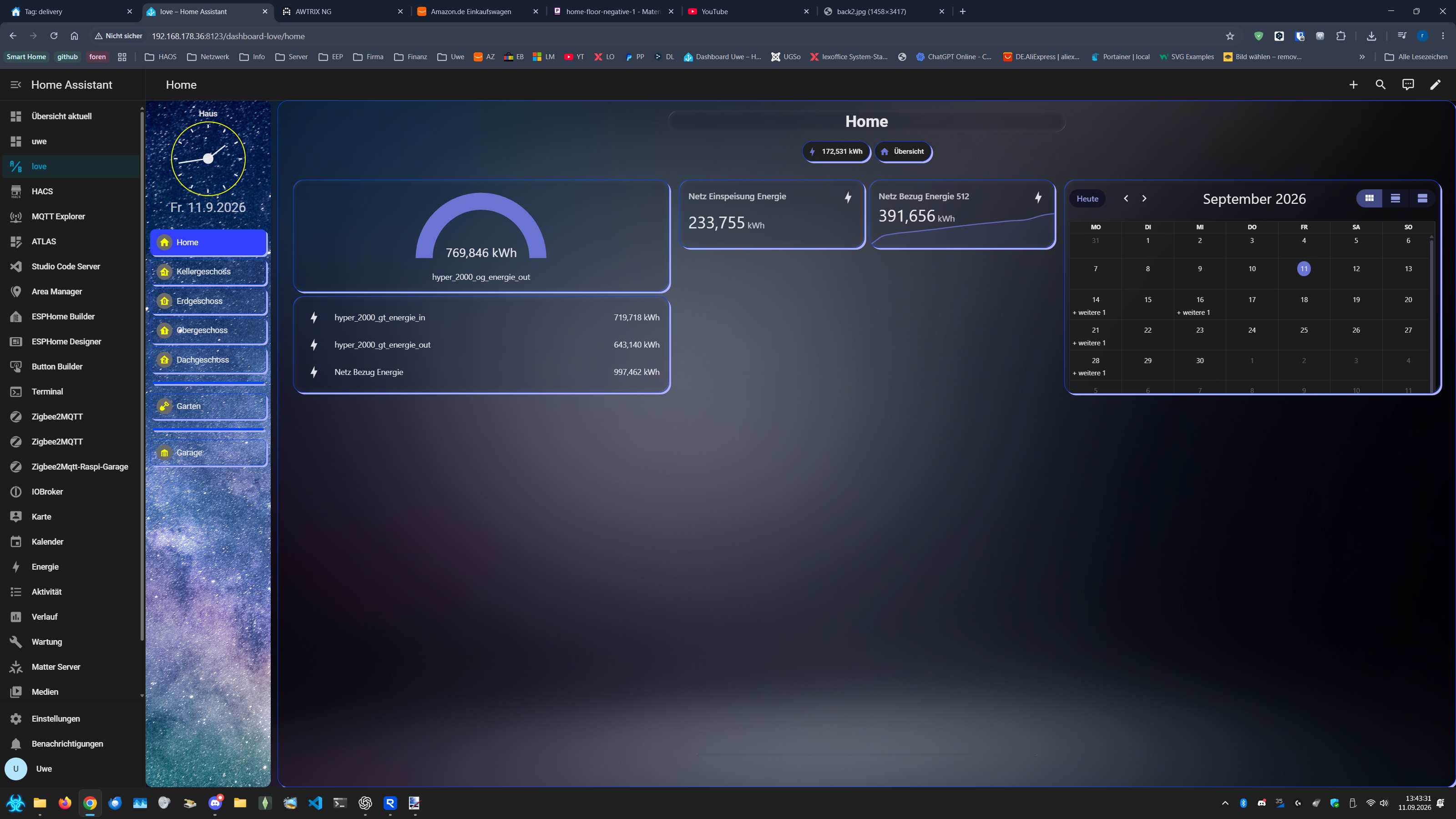
The V2 layouts appear in the normal Home Assistant view layout selector next to the standard layouts.
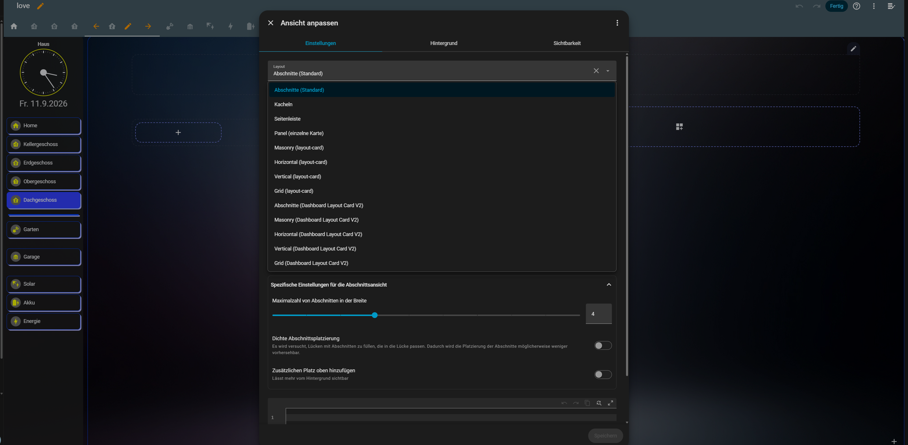
Sections V2 views behave close to Home Assistant's native Sections view in edit mode. Sections can be moved with the three-line drag handle, and the new order is saved back to the view.
Installation through HACS
Add the repository as a custom frontend repository:
https://github.com/rockbaer2007/lovelace-layout-card-v2Home Assistant should then load this resource:
/hacsfiles/lovelace-layout-card-v2/dashboard-layout-card-v2.jsIf an old version is still shown after an update:
- reload HACS repositories
- clear the browser cache
- hard-reload the dashboard
Required helpers
Only the features enabled in the menu need helpers. Create them in Home Assistant under Settings > Devices & services > Helpers.
| Entity | Helper type | Purpose | Required? |
|---|---|---|---|
input_text.dashboard_notification | Text | Optional dashboard notification text. Empty, unknown and unavailable hide the notification. | Only when menu.notify.enabled is used. |
input_boolean.dashboard_holiday | Toggle | Optional day-symbol indicator for holidays. | Only when the day symbol should react to holidays. |
input_boolean.dashboard_birthday | Toggle | Optional day-symbol indicator for birthdays. | Only when the day symbol should react to birthdays. |
input_boolean.dashboard_christmas | Toggle | Optional day-symbol indicator for Advent/Christmas. | Only when the day symbol should react to Advent/Christmas. |
Status values do not require special helpers. They can use any readable Home Assistant entity, for example sensors, binary sensors or template sensors.
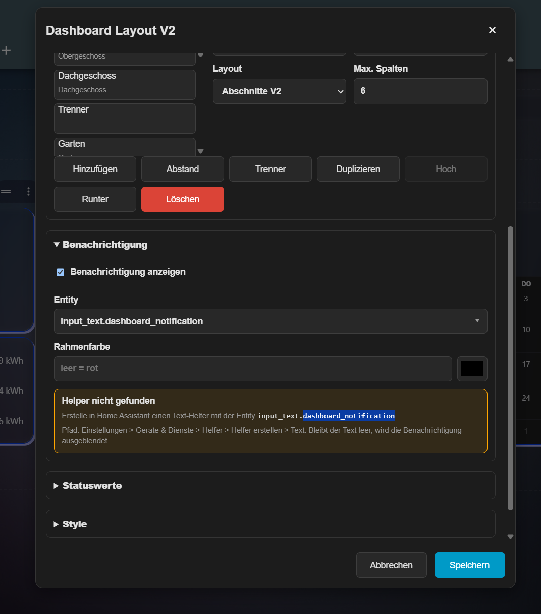
Notification and status values
The optional notification box appears above the status values in the side menu. A text helper such as input_text.dashboard_notification is recommended. While the entity is missing, empty, unknown or unavailable, the box remains hidden. If the helper does not exist yet, the editor shows a short hint explaining how to create the text helper.
As soon as the helper contains text, the message appears in the menu, for example for faults, maintenance notes or short dashboard-wide alerts. Up to four status values can be shown below it. Numeric values are formatted compactly with at most one decimal place.
In icon-only mode, clock, date and status values are hidden; notifications remain available through a compact popup button.
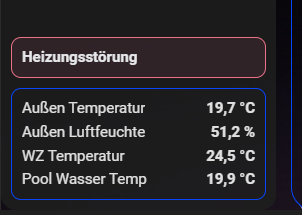
Menu, submenus and colors
At viewport widths up to and including 600 pixels, menu buttons automatically show icons only. Icon-only mode can also be enabled manually, for example for kiosk tablets or wall displays.
Menu entries can have submenus. The submenu is rendered as its own icon column next to the main menu and only shows the subpages of the currently selected main menu entry. The first submenu button can act as the start page for the main menu entry or be disabled so the main entry jumps directly to the first subpage. Submenu buttons currently inherit the main button style, and the submenu background can be configured separately.
Main menu, submenu and home entries can optionally define their own colors. Supported overrides are icon color, active icon color, icon background, active icon background, button color and active button color per entry. Empty fields continue to use the global menu style.
The matching YAML fields are icon_color, icon_active_color, icon_background_color, icon_background_active_color, tab_color and active_tab_color. A reset button can clear only these color overrides of the selected entry when needed; the page, path, icon, submenu and global colors remain unchanged.
Menu, card, notification and status borders have separate opacity sliders. Divider entries can also use their own opacity for the divider color and 3D effect. This makes it easier to tune visible frames, transparent glass styling and compact kiosk layouts.
Editor tabs
The editor window opens wider by default at 80 percent of the viewport width and can be expanded to 95 percent by double-clicking the top bar.
| Tab | Options |
|---|---|
| Menu | Menu position (left, none, right), menu title and global icon-only mode for kiosk/tablet layouts. |
| Home page | Show or hide the home entry, home title, path, icon, per-home icon/button colors, maximum Sections V2 columns, dense section placement, extra top spacing and theme inheritance from the home view. |
| Display | Clock mode (none, digital, analog), analog hour marks, minute marks and seconds hand, date visibility, weekday mode (none, short, long), weekend color, clock/ring color, analog mark and hand colors, holiday/birthday/christmas helper entities and day-symbol size. |
| Pages | Main menu pages, spacers and dividers; title, path, icon, layout type, maximum columns, per-entry colors, reset to global colors, first submenu button behavior, divider color, divider 3D frame color, divider opacity and divider height. |
| Submenu | Subpages for the selected main page with title, path, icon, layout type, maximum columns, per-entry colors and reset to global colors. The submenu tab appears when the selected main entry has subpages. |
| Messages | Optional notification popup based on a text helper, notification border color and opacity, optional status values with up to four entity rows, labels, units, status border color and status border opacity. |
| Styles Global | Clock size, date size, weekday wrap size, tab/text/hover colors, menu border color and opacity, tab 3D frame color, card/content border color and opacity, card 3D frame color, shared 3D offset, icon color, active icon color, icon field color, active icon field color, icon shape, icon size, menu background mode (none, color, image), menu background color and opacity, menu background image, submenu background color and submenu background opacity. |
| Colors | Up to 20 reusable color favorites. The dedicated Save colors button saves only the favorites. |
| Backup | Export the current dashboard editor state as YAML to the local computer. |
| Advanced | Home Assistant chrome settings, optional always-visible admin controls, visible user list and advanced JSON editing for page data. |
YAML backup
The Backup tab can export the current dashboard state as a YAML file to the local computer. The export does not modify Home Assistant and is useful as a backup before larger tests or design changes. The tab is also prepared for a later YAML import action.
YAML language override for screenshots
For documentation screenshots or language testing, the displayed UI language can be forced directly in YAML. This option is intentionally not shown in the editor.
debug:
language: en # de, en or frWithout debug.language, the card uses the Home Assistant or browser language automatically and falls back to English. When the view editor opens and the entry is missing, it writes an empty placeholder so it can be filled directly in YAML.
Background images
Portrait images work best for menu backgrounds. A practical aspect ratio is about 1:2.5 width:height. Other formats are supported, but cover may crop them depending on the visible menu area.
Images must be stored in Home Assistant under www, for example:
/config/www/image/back2.jpgUse this path in the editor:
/local/image/back2.jpgPlease only use your own images or images with a compatible free/open-source license.
Example
views:
  - type: custom:sections-layout-v2
    path: home
    title: Home
    icon: mdi:home
    debug:
      language:
    layout:
      dashboard_layout_v2:
        inherit_theme: true
        menu:
          position: left
          title: House
          show_home: true
          icon_only: false
          home:
            title: Home
            path: home
            icon: mdi:home
          clock: analog
          analog_hour_marks: false
          analog_seconds: false
          date: true
          weekday: long
          style:
            icon_color: "#fbff00"
            icon_background_color: "#ffffff"
            icon_shape: circle
            icon_size: 28px
            active_tab_color: "#333aff"
            inactive_tab_color: "#191c3e"
            tab_border_color: "#fdf9d3"
            card_border_color: "transparent"
            background_mode: image
            background_image: /local/image/back2.jpg
        pages:
          - title: Basement
            path: basement
            icon: mdi:home-floor-negative-1
            layout_type: custom:sections-layout-v2
            max_columns: 3
          - type: divider
            color: "#ffffff"
            divider_opacity: 100
          - title: Garden
            path: garden
            icon: mdi:flower
            layout_type: custom:sections-layout-v2
            max_columns: 4
    sections:
      - type: grid
        cards: []